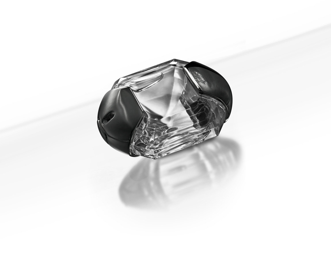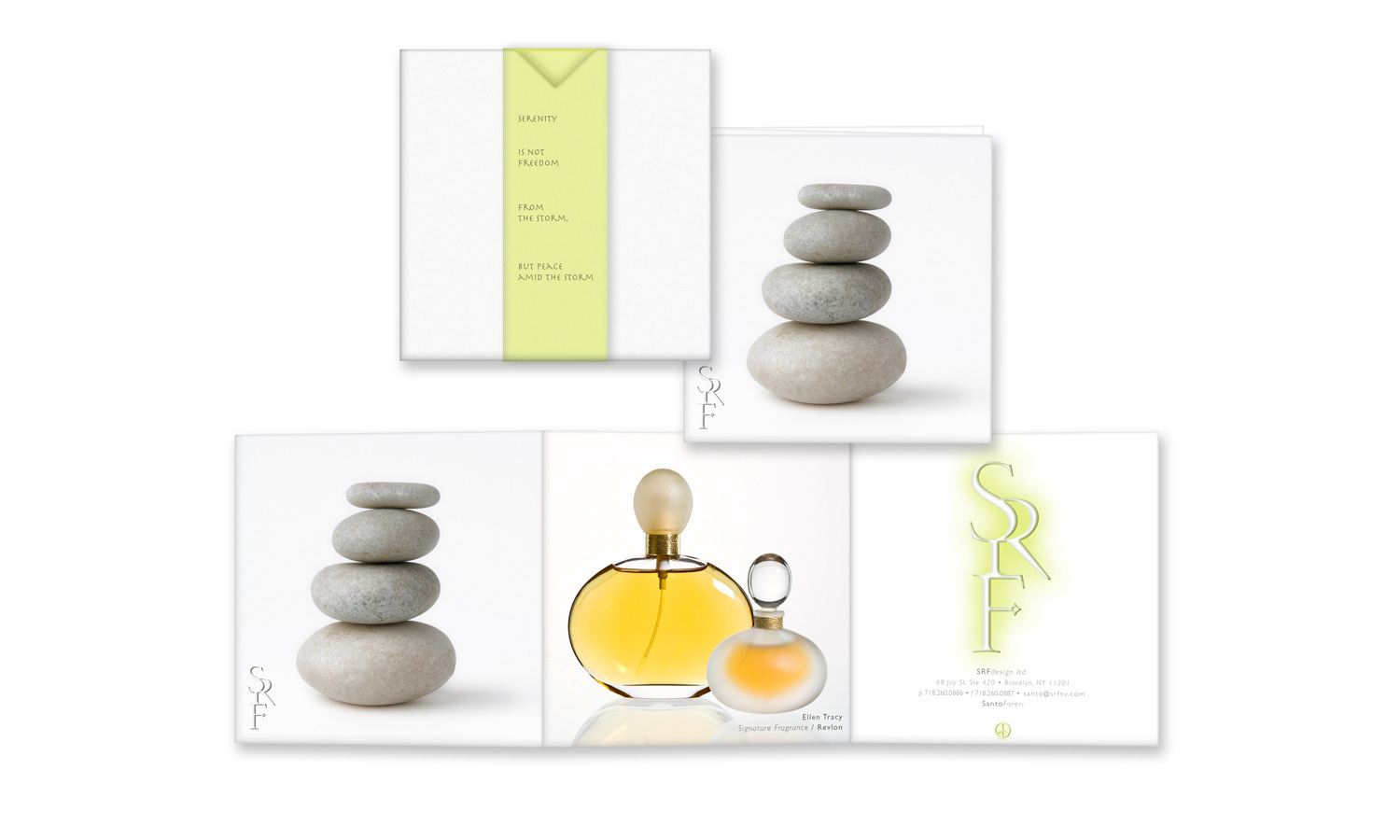
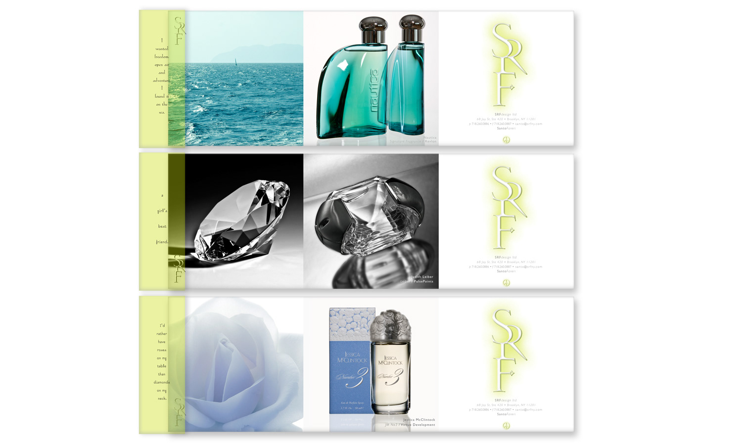
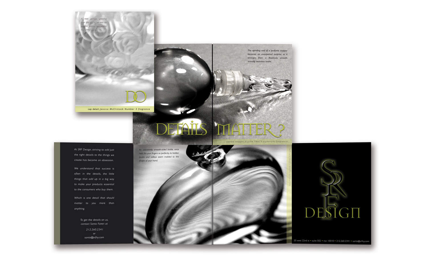
This 4 -part promo highlighted some of our fragrance bottle designs.
Each 3-panel folder featured a photo on the first panel complementing the fragrance design. The second panel held an image
of the fragrance, the third, branding information. The folder was inserted into a pearlized sleeve, & secured with a rice paper band
that was imprinted with copy relevant to the brand's image & positioning. One promo was sent out weekly.
These were the other 3 parts of the promo.
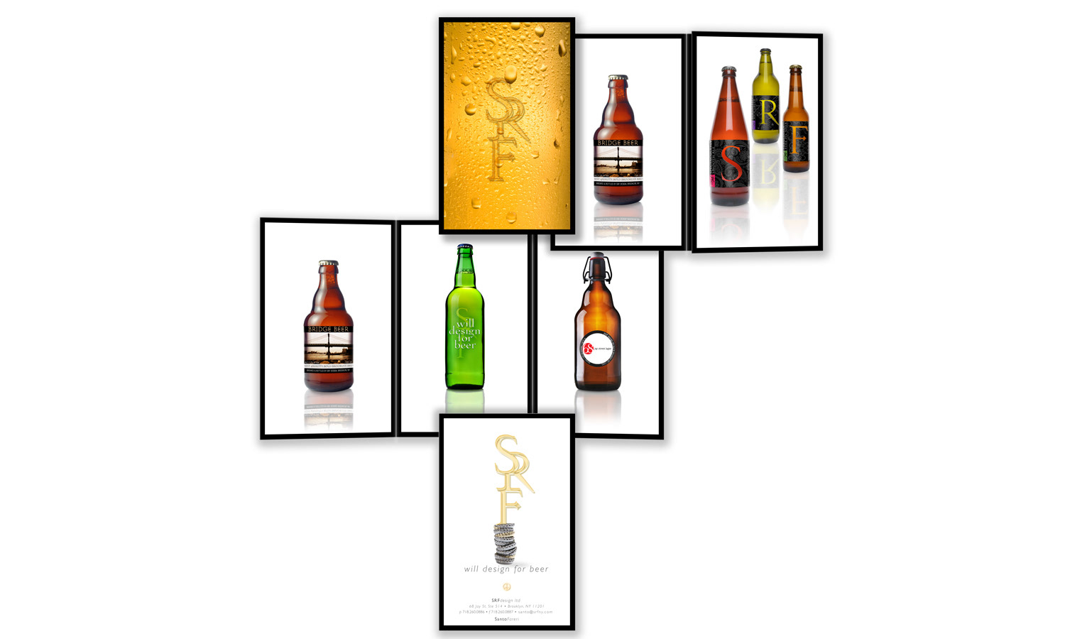
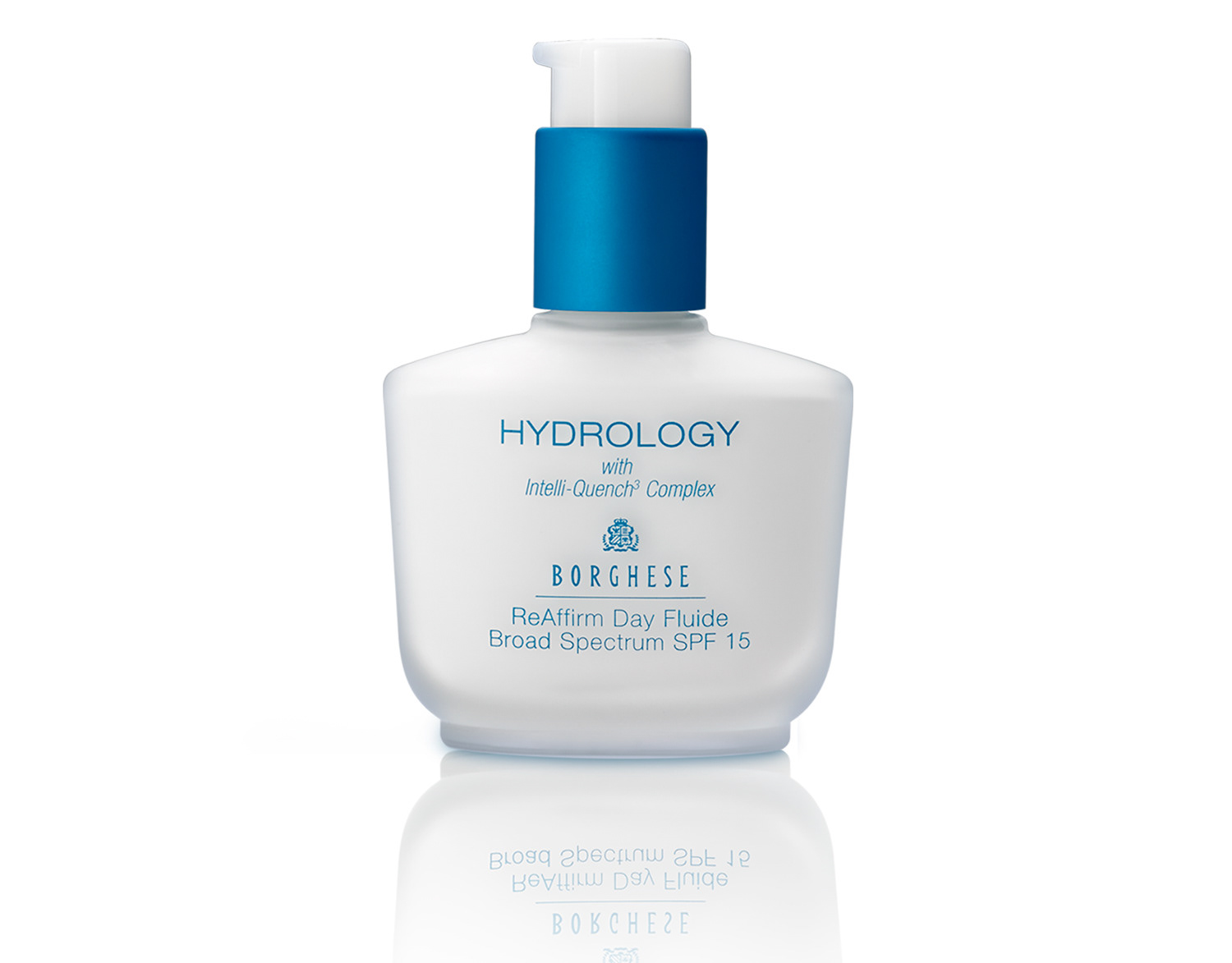
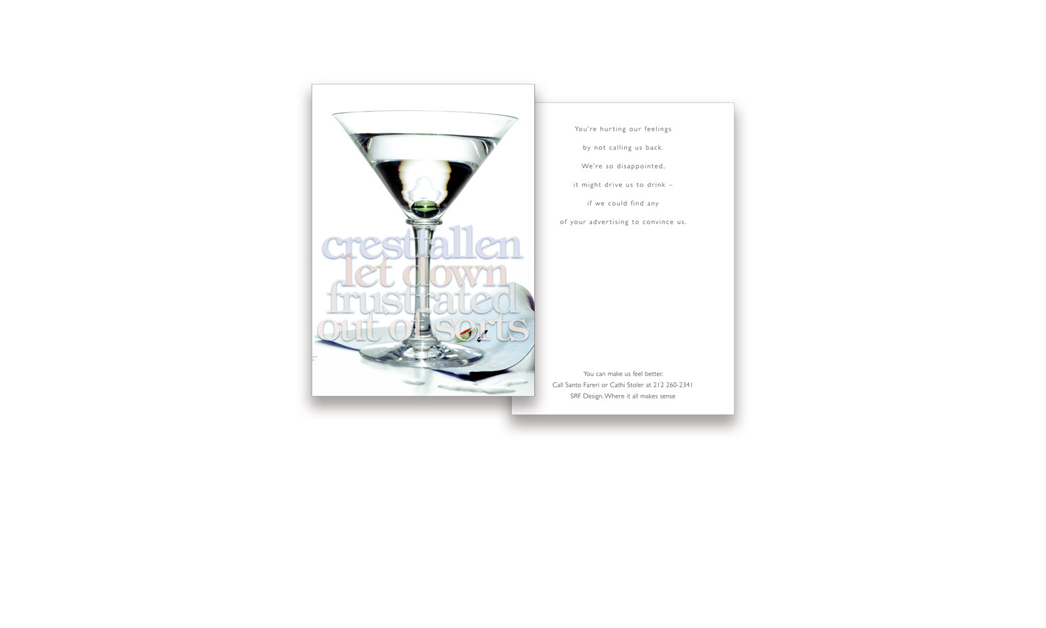
This was one of a number of attempts to work for the adult beverage industry.
I truly believe that designing fragrance packaging would make for an easy transition to designing beer, wine & spirits packaging.
It's possible, though, that I'm the only one, because this latest promo, which stipulates that I agree to "design for beer"
rather than any for other form of payment, still didn't work.
Sadly, I'll have to continue paying for my own wine & beer.
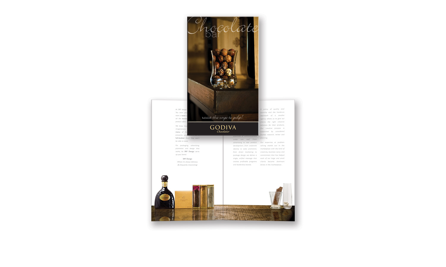
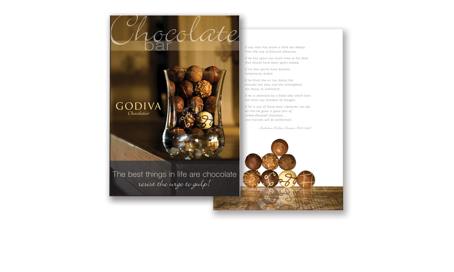
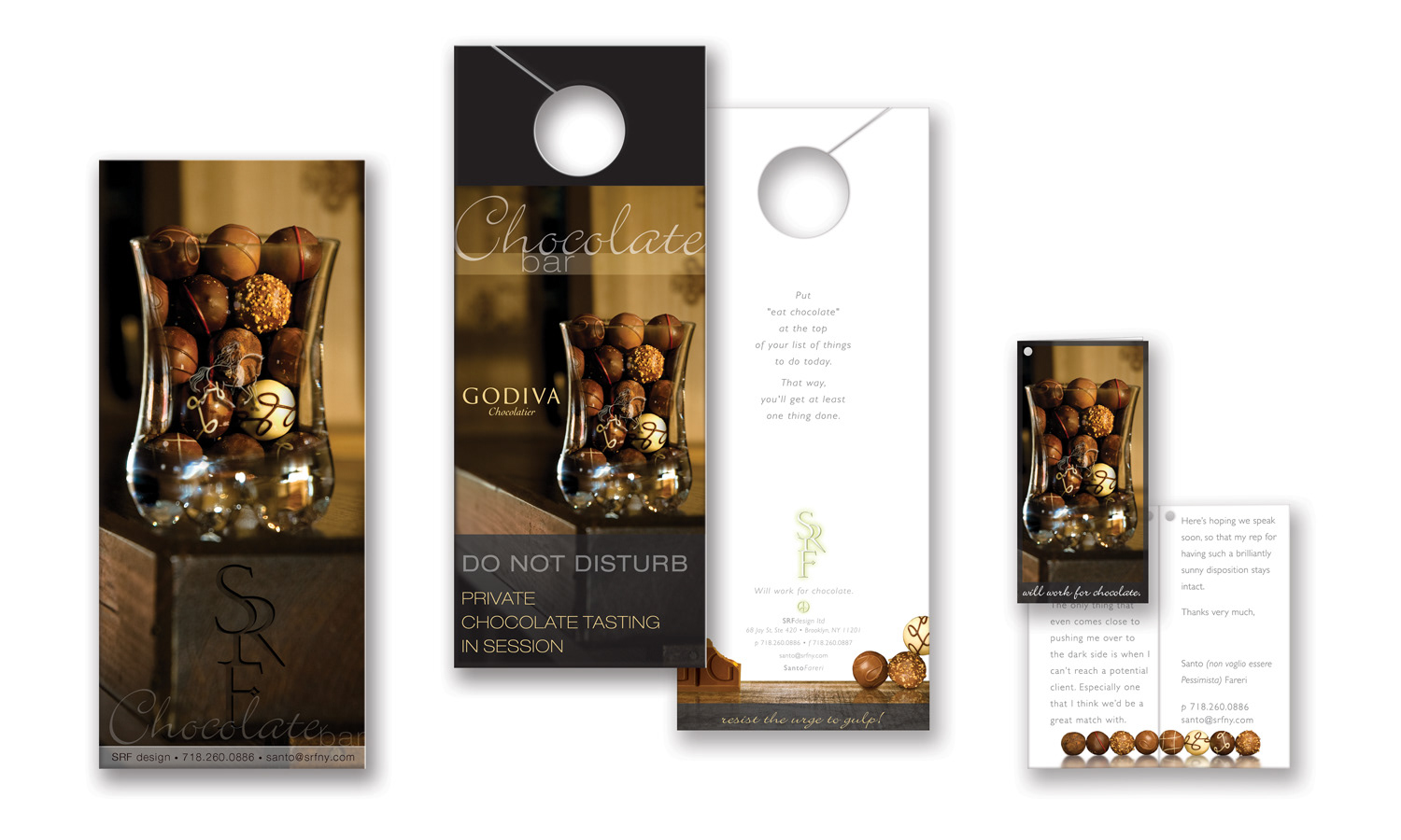
When the beer promo failed to yield results, we began drowning our sorrows in chocolate, which spawned an idea.
This promotion, targeted specifically to GODIVA, was presented as a campaign. Our initial mailing introduced the campaign & our studio.
Following this we sent additional marketing & promotional materials, all created around the central campaign "Chocolate bar".
Among the items developed were an ad, tent card and door hanger. Our final piece was a set box built to hold a wine glass
filled with chocolate which we attached a hang tag to. Our follow up card was delivered a few days later.
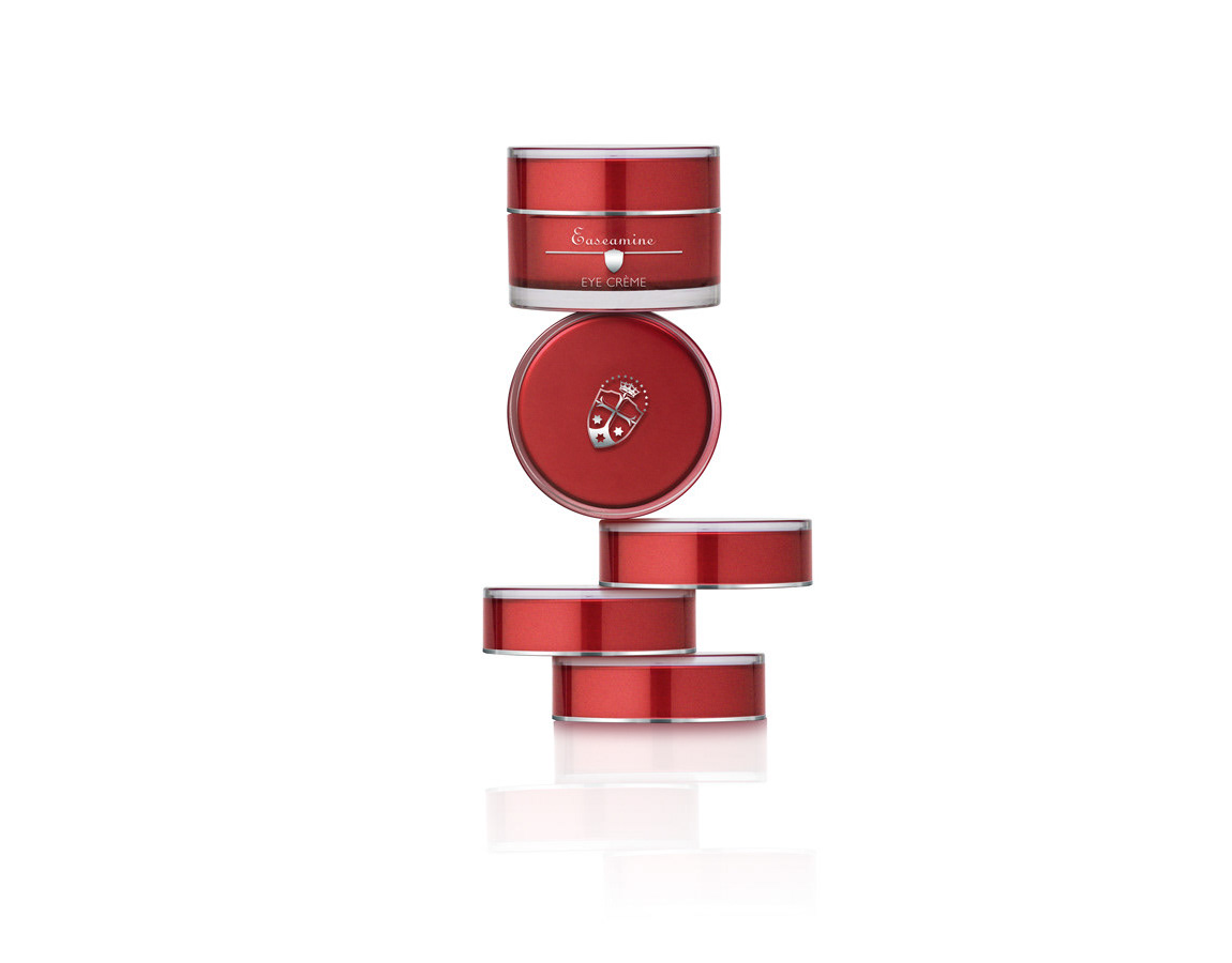
We wanted this promo to highlight the attention to detail we bring to our assignments.
It's our contention that small, surprising details can be the difference between a marginally successful design and one that is brilliantly successful.
To be a truly successful design, it must do more than stimulate it's audience visually.
It should, on some level, stimulate your other senses as well.
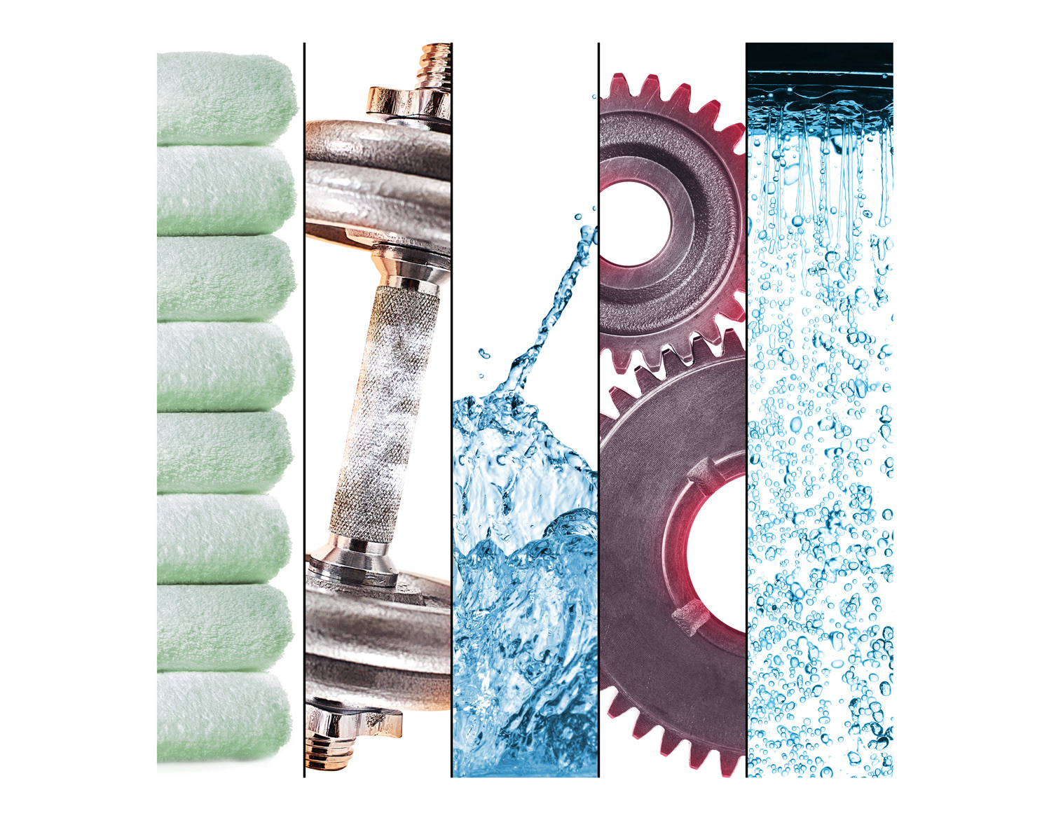
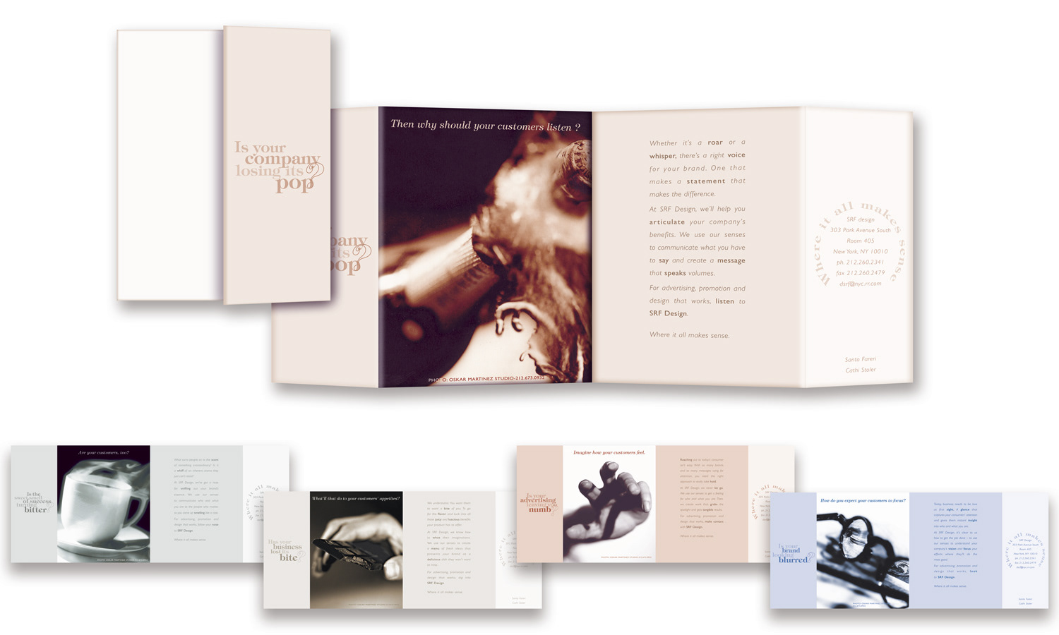
Each part of this 5 -part promo focuses on how design can appeal to one of the 5 senses.
One promo was sent out weekly.
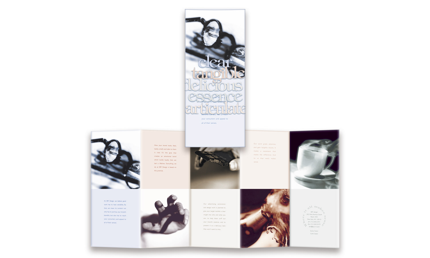
Once all 5 parts of the promo were sent out, we attempted to make contact with the recipients for about a week,
& then sent out this follow-up piece. Folded to letter-size & wrapped in translucent vellum
featuring five key words form the individual promos, it summarized the 5 previous mailings.
If we hadn't been able to make contact, this was sent out as a final desperate attempt to reach them.
Our hope (remember I mentioned we were desperate) was that if we sounded pathetic enough,
someone would give us a pity appointment.
& then, of course, we'd wow them!