
BSF'S original packaging was very industrial & mass-market looking. Their desire was to give the brand a more serious & prestigious appeal.


This renowned hair stylist & colorist wanted to expand her product line's customer base beyond her website & salons,
but knew that to do so meant her brand needed a new image.

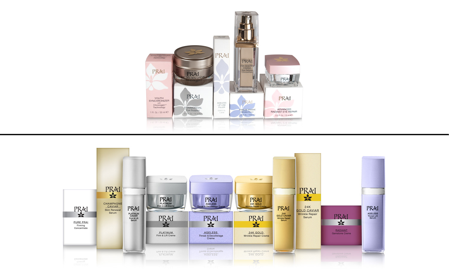
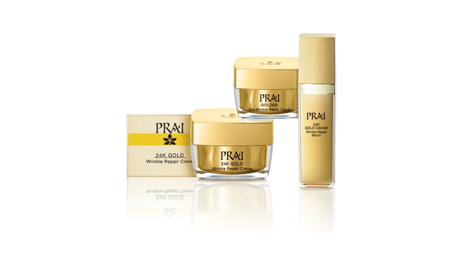
At the time that we were contacted by PRAI, they were planning to expand their base of sales from worldwide TV networks, to add retail sales.
In anticipation of that move, they asked us to reBrand & rePackage their full line of products.
It was essential to PRAI that we kept their logotype & symbol, but we were able to change how they were used.
In addition to ensuring that their lines looked richer, more elegant & vibrant at point of sale, a major objective was to bring a
much needed consistency across all of their lines.

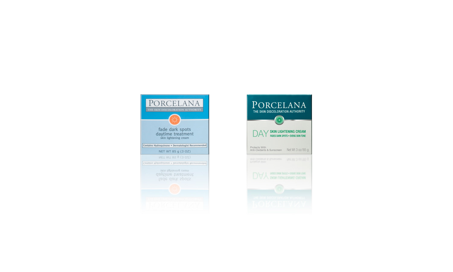
This well established brand was in need of updating. Our Client wanted to maintain the existing logo and componentry.
The rest was open to change.

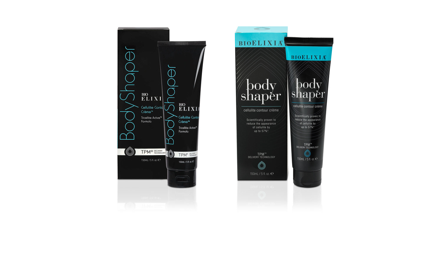
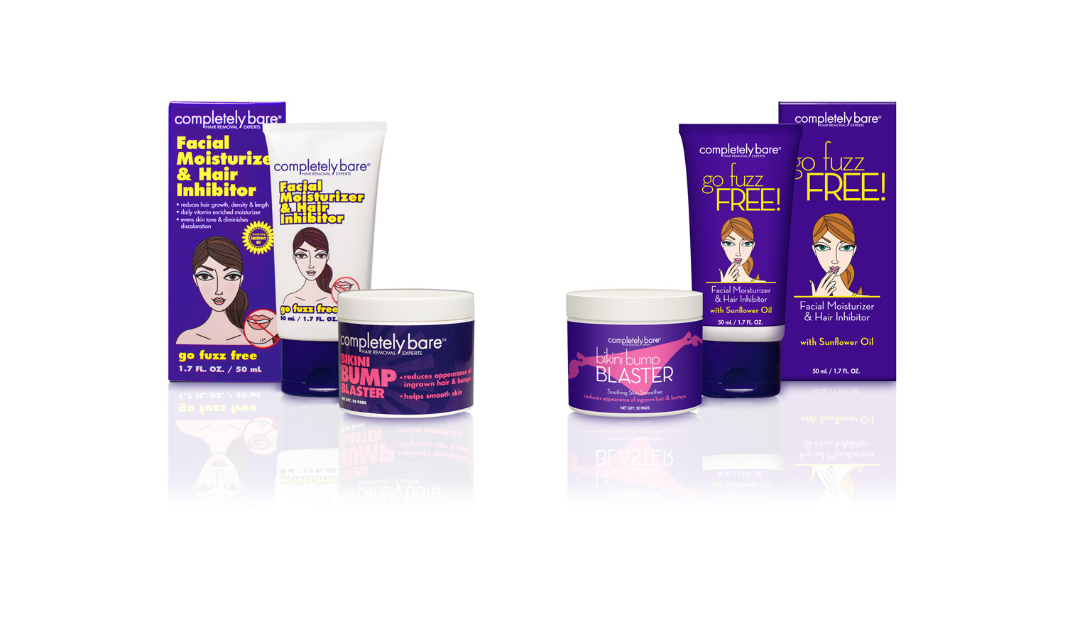
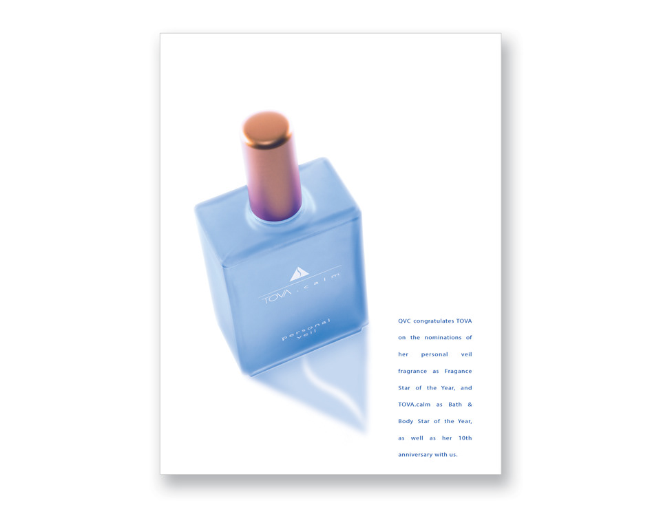
This Australian brand felt the need to revise their packaging & make it more consumer friendly as they prepared to move into the US market.